What is Bounce Rate?
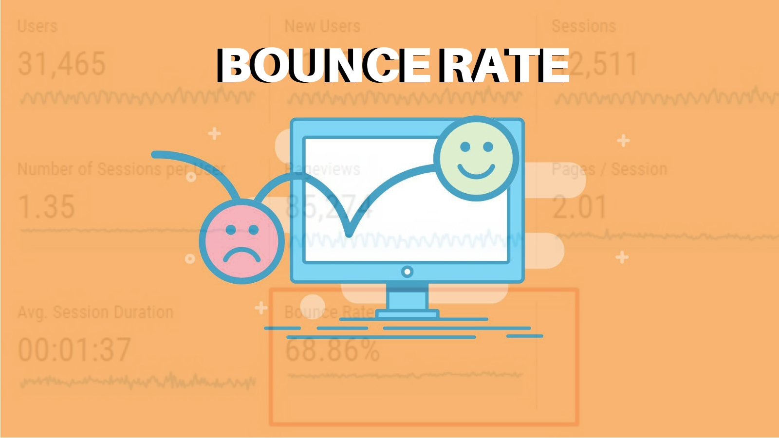
To better understand what bounce rate is, we can use a simple example. Start by imagining you have a physical store on a busy avenue.
There are a lot of people passing by your front doors every day. Some of them look at the products from the outside and show some interest. And a percentage of those feel compelled enough to go in.
But something feels off. A high number of those visitors stop right outside the doors, look around, make a funny face, and leave.
Why?
That is the central question of a strategy to reduce the bounce rate. This indicator shows you the percentage of total visits leaving your website without visiting other pages or immediately after entering.
In that sense, it shows how many leads feel engaged enough to get closer to your brand, but for some reason, not to the point of interacting and consuming anything from you.
Mastering this KPI on a company’s website (especially when it leads to conversions to online stores and digital products) should be one of the key goals in a Digital Marketing plan.
Why Reduce the Bounce Rate?
As it became clear in the previous topic, bouncing visitors are a lost opportunity. They are visitors who took the long digital journey to your website and then left without any interaction.
When we talk about Digital Marketing, engagement is way more important than raw numbers. It doesn’t matter if you have a million visits every day if they don’t lead to a single conversion.
The bounce rate is important because optimization is important. The companies leading the digital field aren’t necessarily the ones with more money to invest, but those who can convert as much as possible in relation to their budget.
When you can give that impeccable first impression, you make them stay. These users feel the need to explore your website, your content, and your brand. And each new page they visit is a step closer to a conversion.
Not only that, but you have more time to make them familiar. Users that stay on your site longer are more prone to come back regularly. They make a habit of it, which leads to sales, brand awareness, and loyalty.
A good strategy to reduce the bounce rate can make a business improve conversion rates with the same digital plan and budget they already have. It is a quicker, simpler way to expand your reach.
What is a Good Bounce Rate?
There’s no ideal number that literally every business out there should be shooting for when looking to reduce bounce rate.
One company might be perfectly happy with a bounce rate of 75 percent, while another would understandably find it horrific.
The difference depends on what your business goals are, as well as your industry and niche.
However, if you’re looking for a ballpark figure to start with, a bounce rate of around 70-80 percent is cause for concern unless there’s a very good reason for it.
Between 50 and 70 percent is about average. And if you’re between 30 and 50 percent, your bounce rate is considered excellent.
What’s considered a good or bad bounce rate can vary from one type of website or landing page to another, as well.
For example, with simple landing pages that carry a single call-to-action, a bounce rate of up to 90 percent is considered average.
Meanwhile, 10-30 percent would be closer to the average for a service site, portal, or similar.
18 Tips to Reduce Bounce Rate in Your Website
With all those points discussed, we can say for sure that an effort to reduce the bounce rate is beneficial in any circumstance and should be green-lighted as soon as possible.
But what can you and your team do to improve those numbers?
We listed 18 tips that will make a difference and help you engage more with the visitors you already have. Check it out.
1. Try to understand why visitors are leaving so early
Let’s go back to our example at the beginning of the article.
You have people entering your store, looking around, and leaving. What is your first question? You should be asking yourself what scared them away.
Was it the store’s layout? Was there a dissonance between the expectation they build and what they found inside? Were the offers off? Maybe the people you are attracting are not the ones interested in your brand?
2. Design a better user experience
All the questions above should lead your team to find elements, tools, and processes that improve your site’s experience.
A good UX starts with a fast and well-structured website, but it goes way beyond that. It is the sum of visual elements, information, and interaction that meets certain expectations and exceeds them.
Again, use your buyer persona as a reference. What do they want when they enter your site? What are they looking for? How can you lead them and even surprise them in positive ways?
Maybe a rework of your pages is what you need to be more engaging.

3. Make sure your website is responsive
With evolving technology, there is an expanding variety of screen sizes, input methods, and device capabilities accessing your website.
A lot of bounce events happen when a user enters your site but can’t easily navigate, or visualize some of the information.
A responsive site is developed to adapt to any of those variants — making sure you don’t lose views for a simple problem like that.
4. Include a clear call-to-action
When looking to reduce bounce rate, you want to avoid doing anything to confuse your visitors. This includes overcomplicating your call-to-action (CTA).
For example, you should definitely avoid cluttering your landing pages with multiple CTAs. Decide on just one decisive action you want visitors to take, make it very clear, and make it honest.
You should also carefully consider the placement of your CTA.
The vast majority of your visitors will decide whether they like your site within seconds of landing on it, meaning they’re simply going to glance at the upper area of the landing page.
Consider placing your CTA within this area, so users know your page objective right up front.
5. Check the readability of your text
Modern web users have a lot of different options to choose from.
If your content isn’t easy to read and understand, it won’t matter how well it answers visitors’ questions. They won’t hesitate to find what they need somewhere else, and your bounce rate will soar.
You can reduce bounce rate by using bigger fonts, so your content is easy to read on smaller mobile screens, as well as breaking up your written content into snackable chunks, so it’s easy to skim.
6. Build some landing pages
One challenge companies stumble upon when working to reduce bounce rates, is predicting the entry points to your site.
It doesn’t matter how perfect your home page is if most traffic comes from a blog article that wasn’t optimized for engagement.
Landing pages are a great solution for that. They are specifically designed to serve as the optimal entry point — with compelling layouts and CTAs.
Think about the opportunities you have to create more of them and how you can adapt your marketing strategy to lead your traffic.
7. Rethink your product pages
If you run an eCommerce site and are looking to reduce bounce rate, you’ll want to look into ways to improve your product pages.
Sometimes a potential customer might bounce from a product page because they’re averse to a price point or perhaps aren’t truly ready to purchase at that time.
But other times, it’s because the page doesn’t have enough information on it for them to know whether or not this is the right product for them.
So think about whether your pages are missing key details that might help a customer convert.

Examples to consider include specs related to the product itself, info on your return policy, or user reviews and ratings.
8. Do some A/B testing
When you still have doubts about what kind of decisions will improve UX and bounce rate, why not test them?
An A/B is a test where you create two different versions of the same page and set them to appear to different visitors as they arrive.
Then you can measure which performed better in retaining traffic. You can consolidate the winner or go from it to another A/B, constantly improving your numbers.
9. Attract the right visitors
Think about the last time you were looking for something specific on a website you landed on via a SERP but couldn’t actually find it.
What did you do? If you’re like most people, you probably spent a small amount of time looking around before simply going somewhere else.
This is what happens every time any website (including yours) attracts a visitor who isn’t a fit for its content.
Make sure you’re attracting the audience who’s actually out there looking for your content and products.
Generate multiple landing pages, fill them with fantastic unique content your target audience will love, and optimize it for relevant keywords.
10. Use visuals to captivate quicker
We, humans, are visual beings.
Having images and photos that are attractive and easily interpreted can grab the lead’s attention way quicker than any text — sometimes even catchy CTAs.
Invest more in visual elements and tie them to the next steps you want your customer to take.
You can make a page truly engaging, rather than one that just receives a passing glance — of course, as long as it makes sense and resonates with your audience.


Replies to This Discussion