Part I. Overview of CTA
1.1 What is a CTA (call to action)?
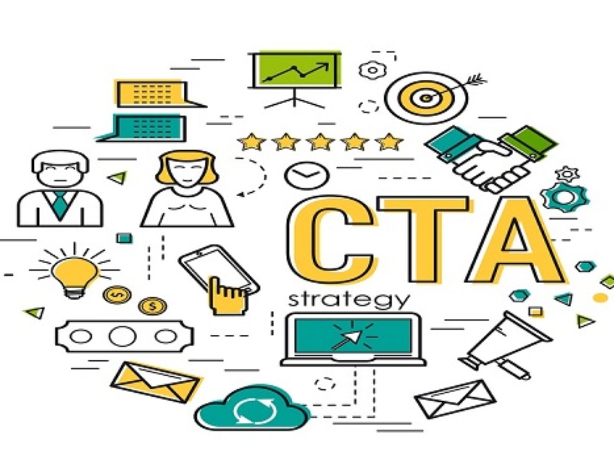
Call to Action (CTA) is a marketing term that refers to the next step a marketer wants his audience or readers to take. In marketing, CTAs help companies convert visitors or readers into leads for the sales team. CTAs can drive a variety of actions depending on the goal of the content.
For example, a CTA can direct a user to click a buy button to complete a sale, or simply turn the user into their potential customer, using that company's goods or products. The CTA might prompt readers to sign up for a newsletter with product updates, for example. To be effective, a CTA must be clear and must immediately follow the marketing message.
1.2 Why are CTAs important?
The call to action is the main element on the website, acting as a signpost letting the user know what to do next. Without a clear CTA, users won't know what to do next to purchase a product or subscribe to a newsletter, or leave a website without taking any action.
What is a call to action that helps prospects know what action to take and eliminates the difficulty of moving users down the sales funnel. Or maybe a call-to-action on a page if that user takes multiple actions.

Part II. Some popular types of Call To Action on the website
1. Collect and manage leads
This is the first type of CTA and also an important one that helps generate leads from your website. Since your goal is to turn leads through this CTA, you need to place them anywhere on your website with a high percentage of visitors.
A common place people place a CTA is at the bottom of their posts or in the sidebar with a floating banner in the corner. To entice users to click, you need to create an eye-catching CTA and convey value when clicking on it – customers will know exactly what to expect when they reach the landing page the CTA points to. These data will be aggregated in the customer management software so that the organization can take the next steps in the care or sales process.
2. Fill out the registration form
This type of CTA is also quite popular because when a customer lands on your landing page, they will do 2 things before they can register as your customer: fill out the form and click to send the information to the agency, your contacts database. With form submission, you can convert unknown visitors into identifiable leads.
3. CTA “Read more”
The “read (or learn) more” button encourages the user to continue reading the condensed information, allowing for a concise display without sacrificing visibility. With this CTA button, you can show your content feed anywhere. This will entice your homepage viewers to click through to each post by introducing the first few paragraphs of your content, followed by a call for action “read more”.
Therefore, make sure that your posts are engaging enough to excite readers. This will help people click on your post instead of scrolling down the homepage.
4. Discover new products or services
These are the most common discoveries found on websites to lead customers to the products and services the company offers. When users review your site to learn about your company and what it has to offer, you want to make it as easy as possible for them to do so. Ultimately, products and services will help your business grow. Therefore, you need to design the CTA so that it stands out and catches the eye on the homepage.
5. Share on social networks
One of the simplest and most effective call-to-actions is a call-to-action that encourages you to share on personal social networks such as Facebook, Zalo. Sharing on social media is an effective way to increase the number of customers accessing and interacting with your brand. So, please actively share useful content on your personal page to increase your reach. You can use marketing management software to increase engagement when sharing on social networks quickly.
III. Some Common CTA Forms
3.1. Button CTA (Button CTA)
Button CTAs are calls to action presented in the form of a button. You can create buttons using CSS, plugins or button images. It can be said that this is the most commonly used form because of its high aesthetic ability and the ability to call people to click more than other forms.
3.2. In-text call to action
In – Text is a call to action presented in text form, assigning a link to the article. Because text often applies to long sentences and is led directly by linking links. As for short sentences, it will be shown by button. What is the advantage of this call to action is a high click rate, improving the user experience to read more useful content such as downloading documents, introducing products ...
3.3 Pop-up CTA
Pop up CTA is a button that appears on the screen unexpectedly when the reader scrolls to a certain paragraph on the page.
The advantage of this type of CTA is that it attracts the user's attention immediately, but it is also annoying because it annoys the user. Pop-up CTA easily creates a bad user experience because users need to click on the shortcut button to return to the reading content if that CTA does not bring a good user experience.
Above has introduced you to all information about CTA - what is call to action as well as the most popular types of CTAs used today. Hopefully, the above content has provided you with a lot of useful knowledge to apply to your business, helping to increase the conversion rate quickly and easily.


Replies to This Discussion